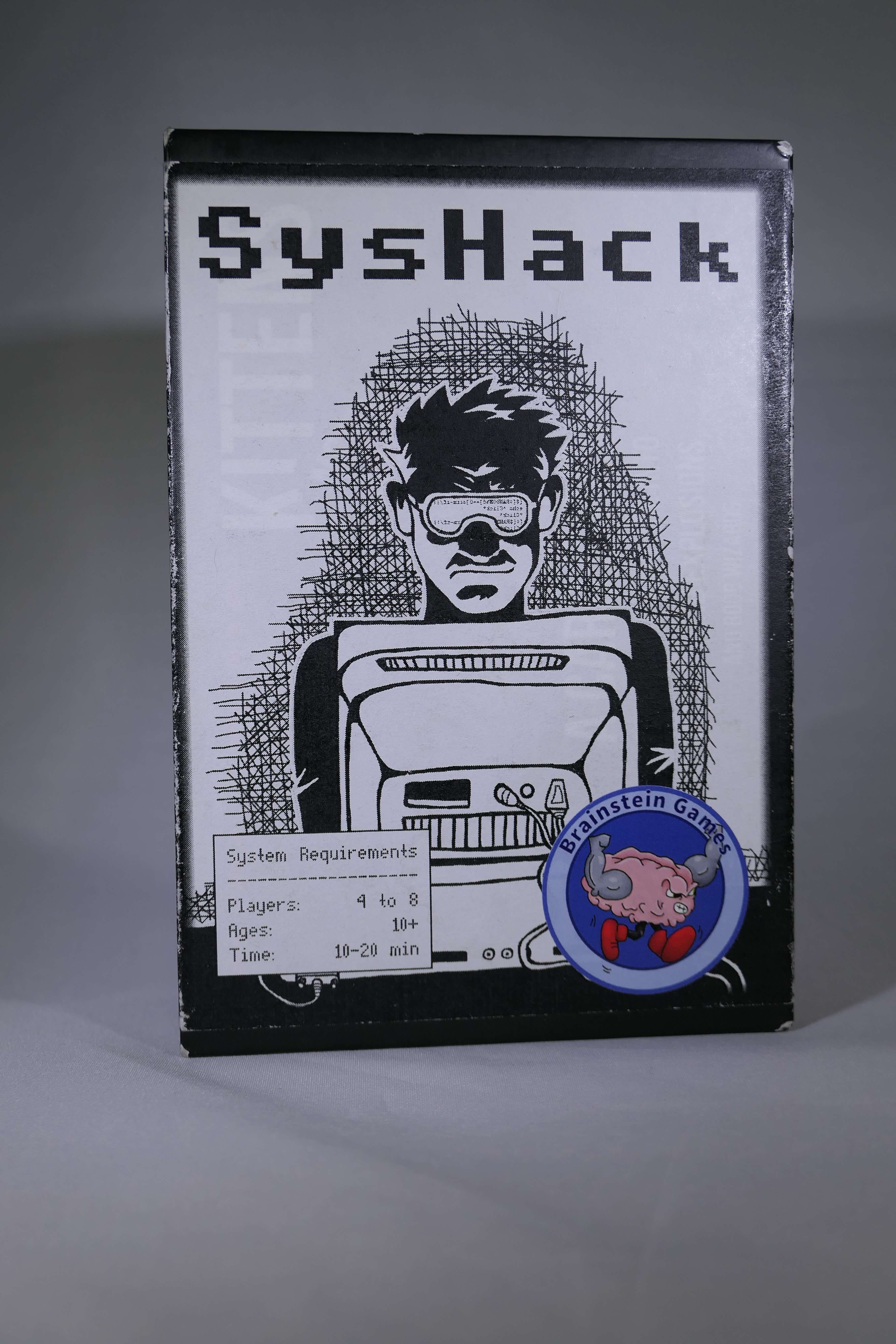
First thing's first. We're fresh off of a successful Kickstarter campaign, and heading into the months where I turn backers' money into a physical product. I've enjoyed some Kickstarter games that only barely funded, so the fact that we not only funded but nearly doubled our goal makes me immensely happy.
However, I can't rest on my laurels for too long, so now that I've allowed myself to enjoy a brief compliment, let's talk about the myriad ways I can put a microscope to the Kickstarter and see what's really happening, both good and bad.
Since SysHack was not a breakout ultra-success like Gloomhaven or Exploding Kittens, the lessons learned from this Kickstarter are likely relevant to most typical game projects.
What I did Right, and Why I did it

These are things I have done not because I'm some creative marketing genius (I get along with marketing the way water gets along with oil), but because I did my research and I've backed my fair share of Kickstarters. From this background, I've made certain decisions that I think have contributed to my campaign's success:
I created a project video that actually pitched the game
This may sound obvious, but it seems more and more Kickstarter projects don't do this enough. Here's what I mean. The usual advice is to make your video shine. Polish it up and make sure it looks good. Bad videos turn away potential backers.
I'm not refuting that advice; it's good advice. No, I'm refuting some of the hidden meaning that people seem to infer from it.
- Just because your video looks amazing doesn't mean it's a good video.
- More importantly, your video doesn't need to look amazing to be a good video.
Most creators decide that they absolutely must have a video with more polish than they themselves are capable of providing, so they pay professionals to make a video with shiny graphics narrated by Orson Welles. And the sheer number of people that hire professionals can lend the impression that if you don't, you're doomed to failure.
But the problem is that those professionals don't care about your game the way you care about your game. I'm sure many of them enjoy games, but in the end, their main concern is making a fancy video.
And they always seem to follow a standard "Kickstarter video template," showing you the components moving around "Night at the Museum"-style. Marvel as the hero piece goes boop boop boop over to the space where the monster piece is! Dice pan onscreen with big numbers! The hero boops the monster, who pans offscreen, and also rotates. Man, that monster got booped so hard it rotated!!!
Or don't marvel, because they haven't actually distinguished what's interesting about your game compared to the gazillion others like it. These professional videos tend to focus too much on the theme, incorporating the gameplay only as far as it tells you more about the theme.
I'm not trying to discount the work those professionals do, though. By properly working with a project creator, the video can turn out quite shiny and still be informative for the backer.
However, for my video I decided to forgo all the "professional shine" in favor of what I'll call "personal shine." I spent money to ensure I had decent lighting (cheap) and a good camera (not cheap), but the shots were just me in front of my games library, or snippets of my friends playing whatever part of the game I was describing at the moment. I also taught myself how to use Lightworks, free video editing software that I'd recommend taking the time to learn.
To me, these are the 3 most important parts of a Kickstarter video, in no particular order, if you're going to go for a "personal shine":
- Decent camera and lighting
- YOU, the creator / publisher
- Describe and show the game (both gameplay and theme, but gameplay is more important).
You can have all the shine in the world, but I'm not backing your game because of its theme, or because it has miniatures. I'm backing your game based on whether I think my group is likely to enjoy playing it.
I informed right away, no hype included
Whenever people point to "really great" project pages, those pages have beautiful graphics with blurbs and bullet points thoughtfully laid out, and include nice color choices to complement the feel of the game.
However, for us normals who don't have the time, ability, or extra cash to make those beautiful images when we present our games to the public, the good news is that what you have written is more important than how pretty it looks.
Once again, I'm not saying those pretty pretty pictures are bad; they're actually nice to have if you can. But even non-graphical content can stand out, and you don't even have to be a brilliant writer.
I adhered to two simple rules when I was writing my campaign text, and I think anybody can do these easily to ensure their campaign is more credible.
Let's call them the 2 Cardinal Rules of Kickstarter Copy:
- Honesty -- tell backers what the game is, what's in the box, and how it works, with the implicit understanding that if that's not the type of game they enjoy, they don't have to back it.
- Brevity -- Just tell us about the game. Don't call the game "the most stupendously amazing commander of your attention since the invention of sliced bread." You want us to back it, sure, but you should let the game do most of the talking.
When you're writing, talk about what the game actually is, not what a seminal work of genius you think it is. A good hook lets players come naturally to the conclusion that your game is worth owning.
If you don't follow the cardinal rules, and instead use what is effectively hype to get through your campaign, you may fund but you're at greater risk of exposing your game to the Kickstarter Effect. That is, the tendency for the ratings of Kickstarter games to drop faster than those of traditionally-published games. It's when a game "feels like a Kickstarter."
Hype builds up momentum for a campaign but risks glossing over things like an incomplete or hard-to-follow rulebook, lack of a proper description of the gameplay, or even a game that could have used a little more development, to name a few common shortcomings of Kickstarter projects.
But eventually, you'll be found out.
The question isn't as much "how can I make the game seem way cool during the campaign," or how much you the creator like your game, but whether we the backers will like it. So tell us what the game is, highlight the things that players and playtesters have liked about it, and let us decide for ourselves whether we agree.
If you don't think you'd fund without hyping the game, then you either need to work on it some more, or just share the game with more people, leaving out the hyperbole.
However, when you finally do start your Kickstarter, please DO mention any awards or accolades your game has received. Any positive references from independent third parties will help backers gain confidence that your game is worth backing.
I included previews and quotes
Well, I included one preview, which I'll come back to in the "where I can improve" section. But to make up for my lack of professional previews, I started asking players a single question after they played my game:
If you were to recommend this game to a friend, what would you tell them about it?
This is a useful question that I'll be asking for future games as well. Anybody who doesn't like the game will decline to give you a quote. Many others will be primed to think about the game as if they were talking to their friends, and will speak normally instead of in a stilted "marketing" voice. And they sometimes say things way better than anything I could come up with, or things that if I said it myself would just come off as bragging. Besides, there are some people (raises hand) who resonate more strongly with what real gamers say than what a professional preview says.
This also falls into the "independent third parties improve confidence" camp I mentioned before.
I brought a crowd on day 1
If I wanted, I could have run this Kickstarter a while ago. But I was worried I didn't have enough people who were already interested in the game. So I kept bringing the game to various events, and asking people if they wanted to sign up for the monthly newsletter, and actually being good about sending that monthly newsletter. Once I built up my list, THEN I decided to run the campaign.
Statistically, if you don't get a good portion of your funding in the first 2 days -- about 30-40% last time I checked -- then the whole rest of the campaign is unlikely to make up for that. In fact, the better the first 2 days, the better the rest of the campaign will perform, since it helps instill confidence to see that lots of other folks are also backing the game (Day 1 backers = independent third parties).
I kept the campaign moving with stretch goals
Jamey Stegmaier (Stonemaier Games) advises creators to be prepared for 2 scenarios: failure to fund, and severely over-funding. And you might think the latter applies mainly to those million-dollar campaigns like Exploding Kittens. I certainly thought so. But after the campaign funded on Day 2, and then we knocked out a few stretch goals in short order after that, it became apparent that I was wrong.
In order to keep interest up, I came up with more goals that would meaningfully add to the game's quality, ran them by the manufacturer to get cost estimates, and added them to the stretch goal list. In doing so, I was able to make each additional pledge more meaningful for the backer, because they were helping to build a better product.
I gave all backers a discount
I don't believe in early bird pledges. Jamey Stegmaier has my favorite write-up on why they're a bad idea, but the basic idea is that you're creating winners and losers, where there should be only winners.
To that end, after I figured out how much the game should retail for (roughly 5 to 6 times the cost to manufacture), I then figured out how much underneath that number I could go for the basic Kickstarter pledge level while still being able to create a game. Then, my premium pledge (another Stegmaier suggestion) was only slightly higher than that, in this case exactly equal to the retail cost of the basic game.
After all, your backers have decided to front you the money to manufacture your game. That's a pretty big favor. Wouldn't it be nice to give them a discount in return?
Where I Could Improve

Phew. I've finally gotten through what I think are the major points that helped my campaign succeed reasonably well. But one success hardly makes me a Kickstarter expert. Here are some things I'll be working to improve on my next campaign:
I didn't spend enough time on the video
I made a video with that "personal shine" I mentioned before, and I think I want to stick to that in general. However, there are ways that I can make the video better next time:
- If the camera is in motion during a shot, it would benefit from a cheap stabilizer. After the fact, I got one that adds a counterweight, effectively moving the center of gravity closer to the wrist. It makes for a much smoother shot, and costs about $20.
- I'll experiment with different ways to convey ideas more effectively. Instead of relying exclusively on friends playing the game, I might experiment with stop-motion, stills using the Ken Burns effect (i.e. zooming and panning), Rahdo-style first person shots, or other techniques.
In general, though, the main point is that I shot and edited the video in a span of about 2 days total. It's a decent video, I think, but if I had spent a week or even more on it, I would have made some changes. The more time it has to simmer, the better the result will be.
I didn't include more than one preview
I think this was one of my major failures. I've already mentioned a few times that independent third parties help give potential backers confidence in a game. Well, previews, paid or not, are an important contribution to that confidence.
The reason I failed to do this was not for lack of trying. It was that I tried too late. I got my one review because I asked about 2 months in advance. That, I think, is the minimum time to allow people to create their previews.
Next time, I'll start asking for previews at least 3 months in advance.
I somewhat mismanaged my stretch goals
Out of the gate, I had a total of 4 stretch goals planned, which accounted for funding $1000 over my goal. I thought there was no way I'd get that far past my goal. When I funded on Day 2, I realized I didn't have enough goals. One of my backers even called me out on it, and I had to scramble to rush some extra goals into the game.
In the end, it turned out fine with 9 goals all unlocked, but now I have a better idea how I want to manage my stretch goals in future campaigns.
- I'll plan stretch goals in reasonable increments, and be prepared to fund up to at least twice the funding goal.
- I'll display the next goal and the one after that on the campaign page, and leave blank areas as stand-ins for later goals to leave myself some flexibility.
- My last stretch goal will be something extra cool, and I'll make that one visible from the beginning so people know what they might be getting if the campaign goes really well.
My graphics were just okay
You can probably tell by how long this blog post is; I really love to write but I'm not much for images.
I actually am decent at graphics programs like InkScape, but like the video, I didn't put the time into them that I should have. It's a minor thing, because they still conveyed what I thought they needed to convey, but next time I'll put a little more time into the graphical content. It won't exactly be fancy, but it'll be better than what I had for SysHack.
I should have gotten feedback before going live
This is the other big point of failure. I'm part of multiple design communities that would have been more than willing to help critique my Kickstarter page.
You'll notice that the "where to improve" section of this post is somewhat shorter than the "what I did right" section. This isn't because I did everything right; it's a case of "I don't know what I don't know." And that's where feedback from others in the community becomes invaluable. Everybody brings something different to the table. Other creators are going to be able to point out things that you may not have even considered.
That about wraps up this post. One last thing I'd like to mention: my goal with the SysHack campaign has never been to get the most backers, otherwise I may have taken a different approach. Rather, my goal was to get the right backers; those people who are most likely to actually enjoy the game. Yes, getting more of the right backers would have been nice, but when it comes down to it, I don't want to convince anybody to buy a game unless they'll enjoy it. Doing anything else would just seem disingenuous.
